It was already clear to me at the beginning of 2020 that I would make a photo book with my personally best photos at the end of the year. Today the photo book finally arrived. What can I say? It's just great to have the selection of your own pictures of the whole year in your hands in print. The path to the product was not always easy. Many decisions had to be made. I would like to take you along with me with some sample pages in this blog entry and at the end you will learn why I am not 100% satisfied.
Which book format do I choose?
Since I knew from the start that I wanted to include both landscape and portrait format pictures in the book, as well as two or three special formats, it was actually clear to me from the start that the photo book had to be square. For me this has aesthetic reasons. I don't like it when landscape format photos are printed in portrait photo books and vice versa. I always wanted to have a photo on one page. For me, the square format was the best choice.
Do I only choose black and white photos or also color?
I clearly wanted both in the book. I mostly take photos in black and white, but there are also some of my pictures that I like much better in color and I wanted to include them.

How many pictures do I choose?
This was without a doubt the point where I struggled with myself the longest. First I made a pre-selection of my pictures. I went through the places I visited in 2020 and gave the images I wanted in the book the keyword "yearbook" in Lightroom. Some pictures were given the keyword directly during the year. So initially a certain number accumulated. Then I made my first version of the book and saved it as a PDF file. I felt there were too many pictures in the book, so I deleted some and made a second, shorter version. Then I had the feeling that some would be missing. The more I thought about it, the more determined I was to actually take all the pictures I thought were worth being part of this yearbook. In the end I came up with a total of 76 pictures, 58 of which are in black and white and 18 in color.
How do I arrange the pictures?
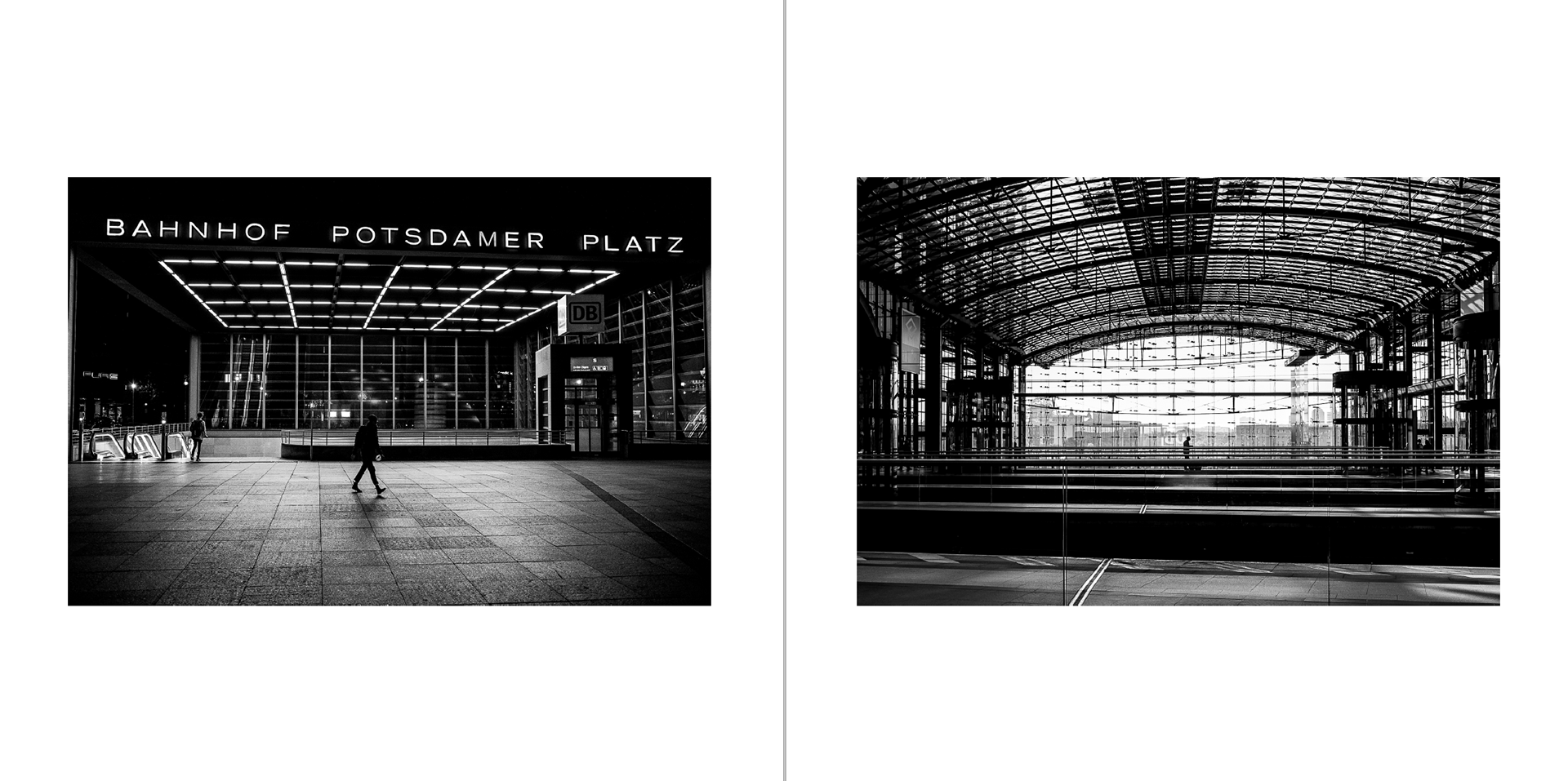
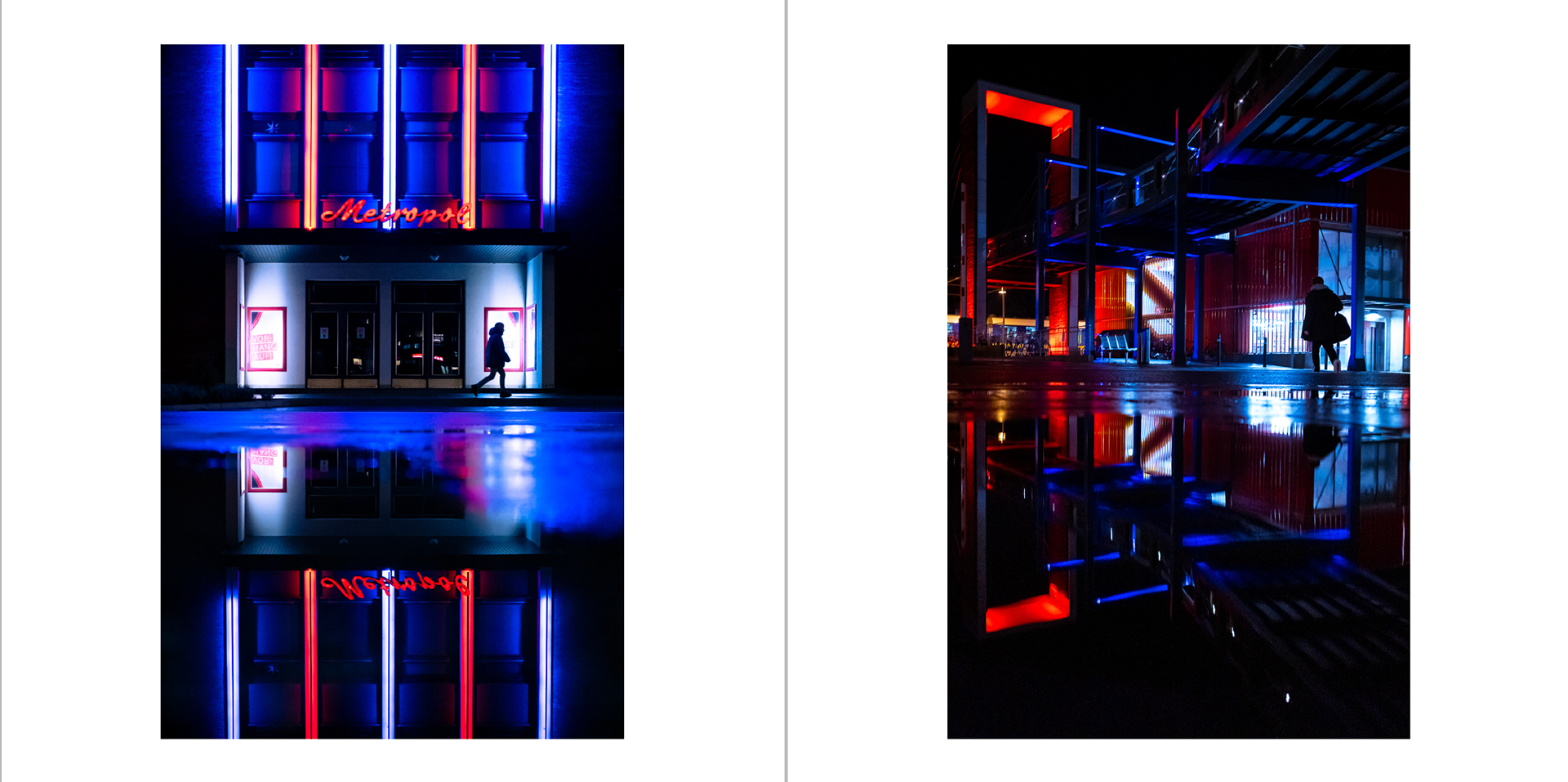
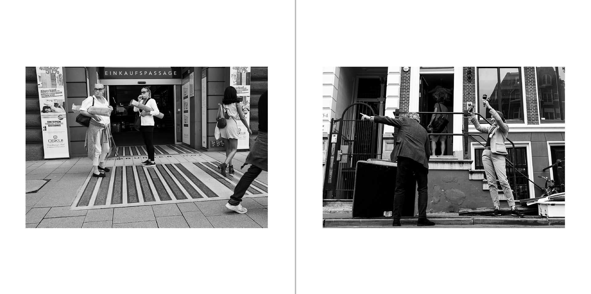
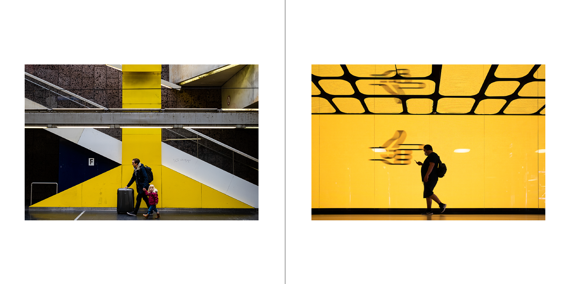
In addition to the selection of the pictures, this point was the one that took the most time. I had already made several photo books from various vacations and from our world trip, but the sequencing there was clearly pre-structured by the chronological order of the trip. In the current case, however, I didn't want the images to be based on a date, but rather they should follow a concept. Since the photos with strong light and shadow contrasts as well as minimalist shots are most important to me, I put them together in the first category. Next, I wanted those photos in the book that correspond to the classic definition of street photography, i.e. moments on the street that show candid scenes. Then came the street photos in color and finally I chose the few street photos at night that were also in color. That structure just felt right, so I kept it. Within this category I also looked at how the picture on the left could best be merged with the picture on the right. Pictures were often pushed back and forth until it finally felt right.
How can I give the book something special?
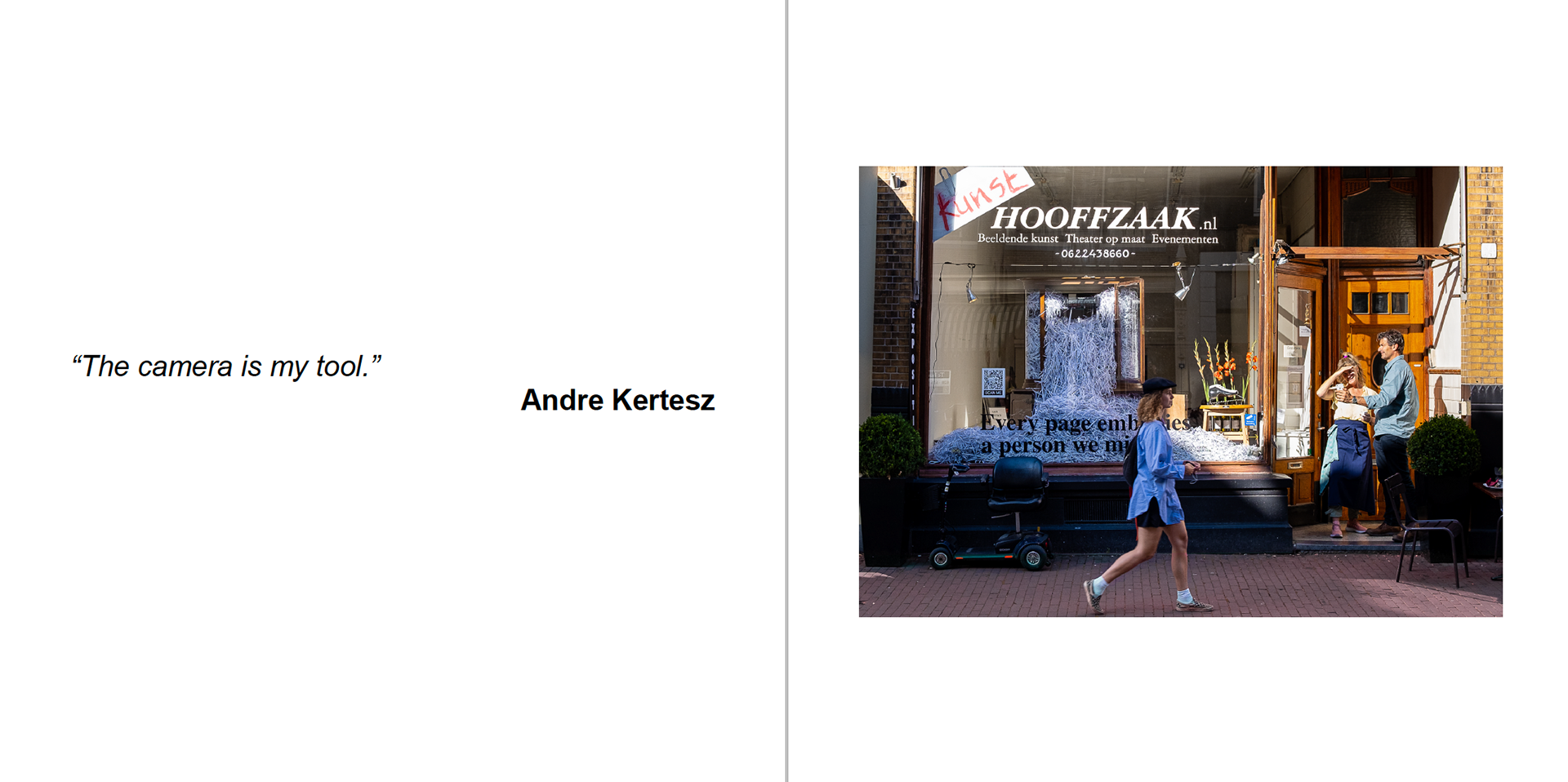
I wanted something special in the book. I remembered Sean Tucker's yearbook. He occasionally added quotes from his YouTube videos to his yearbooks. I liked that idea. I just didn't have my own quotes. While looking through the street photography book "Magnum Streetwise" I really liked some quotes from famous street photographers and I marked them. At the same time, I googled for further quotes and then selected the ones that had the greatest impact on me. I put three quotes, that were really striking for me, at the beginning of my book and gradually added a few more. In my eyes, this gave the book that certain something.

Which company should print my photo book?
I like the book function in Lightroom, because I can put my pictures directly from the catalog in a book. I can also use this function to save my book as a PDF file in advance. Lightroom works with Blurb. Blurb met my criteria for designing a square book. In addition, Blurb always has good offers that can save you a lot of money. Blurb also offers the option of selecting different types of paper. During the year I had a test kit sent to me by Blurb. The six different types of paper could be tested haptically and you could see how black and white photos and color photos look on the respective paper. I actually wanted to use uncoated paper. When looking through the respective types of paper and the effect of the black and white photos, however, after a little longer consideration, the standard paper convinced me the most. The only disadvantage: the paper only had a density of 118g / m2. I would have liked it to be at 148 g / m2, as I find thicker paper a little more pleasant to leaf through in a book. Still, I stayed with my choice.
What's on the cover?
This question bothered me for a long time. I definitely didn't want a photo on the cover. A logo or lettering should be produced, which I can also use in the following years. I tried a few things right in Lightroom. But here I was missing functions in the text module. So I made a lettering in "Affinity Photo". I made 5 or 6 versions. I really like the lettering on my homepage, so I chose this font. In addition, the year should be on it. First I wrote "2020". But this didn't work. Suddenly I had the idea to try Roman numerals. 2020 became MMXX. I liked this very much. This would also look good for the following years. In the end I decided on the lettering that you can see above. I like that it's relatively simple and centered on the cover.
My conclusion
Designing my first street photography yearbook was an interesting experience. The selection, the categorization and the sequencing of the pictures presented me with challenges. I am almost 100% satisfied with the end result. I like the Blurb print, the colors look great too. I had to take the smear with the slightly thinner paper. However, in the end I am a little disappointed with the size of the book. I chose my book in 18x18cm, it is now only 17x17cm in print. I was firmly convinced that this would be enough. Now that I have it in my hands, it's a little too small for me. 21x21cm would certainly be better. I wasn't in the mood for a big square book measuring 30x30cm. However, three to four centimeters more would make a huge difference to me personally. For this reason, I am considering designing a second version from another supplier, who offers this size in order to compare both products. But then I also have to fall back on another paper, which again has a different effect. Still, I think it's worth the comparison. After all, the yearbook should be continued, so it should fill my shelf in the same style the following years. For this I need a product that I am firmly convinced of. Now is exactly the right time to experiment.
Are you interested in the book?
If you´re interest in the book, I will offer the following options. Leave me a message via "Contact" on this homepage and I can send you the PDF version of the book free of charge. If you are seriously interested in a printed version, you can of course also contact me and we will discuss the details. For your information: If there are at least 10 interested persons, it will be significantly cheaper for each individual.